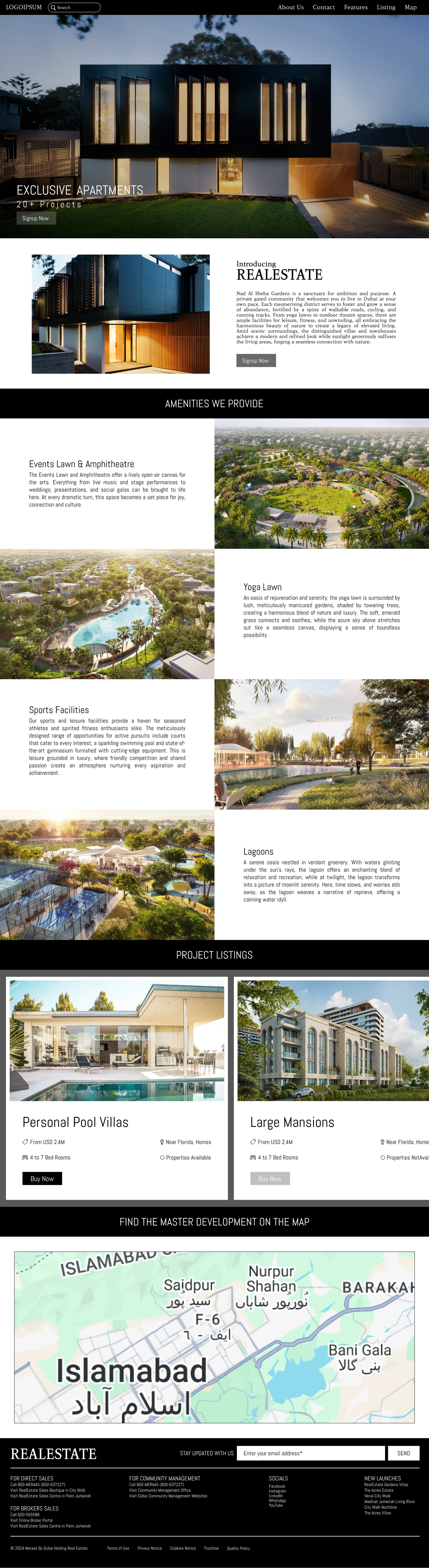
In the digital-first era, the real estate industry is no longer confined to physical site visits and newspaper advertisements. Buyers and investors today prefer to start their property search online, exploring listings, comparing prices, and even taking virtual tours before deciding to meet a realtor. This shift in consumer behavior has created an undeniable demand for intuitive, modern, and engaging real estate websites. A well-structured website is not just a tool to showcase properties, it becomes a brand’s identity, a client’s first point of interaction, and a major driver of conversions.
This case study dives into the complete process of designing a Real Estate Website using Figma, highlighting the research, ideation, prototyping, and design execution. It also explores the key UX/UI principles applied to ensure an easy-to-navigate, visually appealing, and user-centered solution tailored for property buyers, sellers, and agents.
The final design aims to solve industry pain points such as poor user experience, cluttered layouts, lack of trust, and slow search processes, offering a seamless and professional platform for users.
Project Overview
Client/Project Context
The project was initiated to design a modern real estate platform that:
- Showcases properties attractively.
- Provides advanced search and filtering options.
- Establishes credibility and trust in the brand.
- Offers a smooth and responsive browsing experience across devices.
The goal was to design the website prototype entirely in Figma, ensuring scalability for development teams later and maintaining a collaborative workflow.
Target Audience
- Home Buyers: Individuals and families looking for residential properties.
- Property Sellers: Owners wanting to list and sell their properties quickly.
- Real Estate Agents: Professionals showcasing portfolios and connecting with clients.
- Investors: Users seeking commercial spaces or properties for return on investment.
Research Phase
Before moving into design, extensive research was conducted to understand industry standards and user needs.
Market Research
Competitor analysis was carried out on platforms such as Zillow, Realtor, Trulia, and Redfin. Key insights included:
- Minimalist layouts with white backgrounds and ample spacing.
- Prominent property images driving user attention.
- Advanced filter systems (price, location, size, amenities).
- Trust-building elements such as testimonials, agent profiles, and certifications.
User Research
Interviews and surveys were conducted with potential buyers and sellers. Some pain points they mentioned:
- Cluttered sites that feel overwhelming.
- Lack of accurate or up-to-date listings.
- Difficulty in filtering search results to match exact needs.
- Mobile-unfriendly platforms.
From this, we defined clear user needs:
- A clean, modern design.
- Smooth navigation.
- Mobile responsiveness.
- Easy access to property details and agent contact.
Problem Statement
“How can we design a real estate website that combines trust, efficiency, and visual appeal—allowing users to browse, filter, and connect effortlessly, while empowering agents and sellers to showcase properties effectively?”
Goals and Objectives
- Create an intuitive and aesthetically pleasing design.
- Prioritize user-centered navigation with search and filter options.
- Use Figma to design modular, reusable components.
- Design responsive versions for desktop, tablet, and mobile.
- Enhance credibility with agent profiles, testimonials, and blogs.
- Encourage conversions (inquiries, property visits, direct calls).
Design Process in Figma
The design was structured using the Double Diamond Design Process
(Discover → Define → Develop → Deliver).
Step 1: Wireframing
Low-fidelity wireframes were created in Figma to visualize page layouts and information hierarchy. Focus was placed on:
- A strong hero section with search functionality.
- Featured property listings.
- Clean navigation bar with primary categories (Buy, Rent, Sell, Agents, Blog).
- Clear CTA (Call-to-Action) buttons like “Schedule a Visit” or “Contact Agent.”
Step 2: Style Guide
A consistent design system was developed in Figma with:
- Colors: Blue (trust), White (clarity), Gray (neutral balance).
- Typography: Sans-serif fonts for modern readability.
- Buttons & CTAs: Rounded corners, hover effects, primary and secondary states.
- Icons: Simple and recognizable for filters and amenities.
Step 3: High-Fidelity Mockups
The polished UI screens were developed with real content and imagery. Pages included:
- Homepage
- Hero banner with search bar.
- Featured property carousel.
- Testimonials and blog previews.
- Property Listings Page
- Grid-based property cards with images, price, location, and key details.
- Filters for property type, price range, and location.
- Sorting option (Newest, Price Low-High, High-Low).
- Property Details Page
- Large property images/gallery.
- Details like size, bedrooms, bathrooms, amenities.
- Contact form and agent profile.
- About Us Page
- Company values and mission.
- Team/agent introduction with photos and bios.
- Contact Page
- Interactive map.
- Quick inquiry form.
- Blog Page
- Informative real estate articles.
- SEO-driven to increase visibility.
Step 4: Prototyping in Figma
Interactive prototypes were built with clickable navigation, hover states, and transitions. This allowed simulation of the end-user journey before development.
Key Features in the Design
- Smart Property Search & Filters
- Location, price, property type, number of rooms.
- Interactive sliders for budget.
- Mobile Responsiveness
- Mobile-first approach.
- Simplified filters for smaller screens.
- Trust & Transparency Elements
- Verified agent badges.
- Testimonials section.
- Secure branding with a professional layout.
- Lead Generation Tools
- Prominent “Contact Agent” buttons.
- Quick inquiry forms integrated into every listing.
- Visual Hierarchy
- Larger property images prioritized.
- Bold headlines and clear CTAs.
Tools & Techniques
- Figma for wireframes, high-fidelity mockups, and prototypes.
- Auto Layout & Components for consistent scaling.
- Grids & Constraints to ensure responsive design.
- Plugins like Unsplash (images), Iconify (icons), and Contrast (accessibility check).
Challenges Faced
- Balancing Content & Visuals
- Too much text distracted from property visuals; we minimized copy and used icons.
- Filter Complexity
- Designing filters that were powerful yet not overwhelming required multiple iterations.
- Maintaining Consistency Across Devices
- Responsive designs had to adapt without losing aesthetics, solved using Figma’s auto-layout and constraints.
Outcomes
The final design achieved:
- A modern and professional interface.
- Intuitive search and navigation.
- Mobile-friendly user experience.
- Increased credibility through design trust signals.
Stakeholder feedback highlighted the clean UI, effective filters, and strong user flow.
Future Enhancements
- Integration of 3D virtual tours for properties.
- AI-based property recommendations.
- Advanced analytics dashboard for agents.
- Chatbot integration for instant inquiries.
Conclusion
This project showcases how strategic UX research and thoughtful UI design in Figma can transform the digital experience for real estate businesses. The design not only addressed pain points but also provided a scalable system for developers. By emphasizing usability, trust, and responsiveness, the final website design positions itself as a competitive solution in the real estate market.
A well-designed website is more than an online listing platform; it becomes the bridge between property seekers and agents, ensuring smooth communication, trust, and conversions.
Through this case study, the importance of Figma as a collaborative, scalable design tool is also highlighted, showcasing how designers can deliver high-quality, interactive prototypes that serve as the backbone for development teams.
The Real Estate Website Design stands as a prime example of how research-driven, user-centered design can redefine digital presence in one of the most competitive industries in the world.
Let's build your next case study.
From strategy to execution, Rafenthic helps you grow with clarity and impact — whether you're starting out or scaling up.